Button
To create a Button, click on the Insert Button  in the Editor
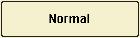
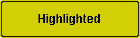
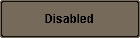
You control how the button looks by setting the Fill type on each of the 4 button states.
To create a Button, click on the Insert Button in the Editor
You control how the button looks by setting the Fill type on each of the 4 button states.